Where menu colors come from
The Beaver Builder Theme has many interacting header and nav menu settings, which also depend on header layout. This article shows examples of how the header and nav menu colors change as screen size decreases and how to change the colors.
Two types of header layouts
The main distinction in how menu colors are assigned comes from the two types of header layouts:
- Those in which the menu appears in the main header area
- Those in which the menu color appears in a nav bar below the main header area.
Here's a table that shows which header layouts fall into which category.
Table 1: Nav menus according to whether they appear inside or outside the header area
| 1. Menu appears in the header area | 2. Menu appears outside the header area |
|---|---|
| Nav Left | Nav Centered |
| Nav Right | Nav Bottom |
| Nav Centered + Inline | |
| Nav Vertical Left | |
| Nav Vertical Right |
Here's' one example from each header layout category, to show changes as screen width grows smaller and where to change the colors.
Example 1: Nav Right
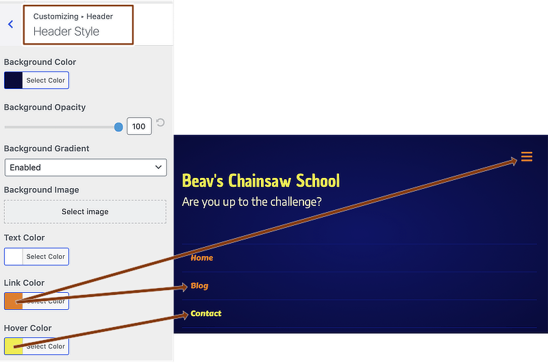
In the first category of header layout, the menu appears in the header area. The header background and menu text colors come from Header > Header Style.
Figure 1: Nav Right menu color sources, large screen
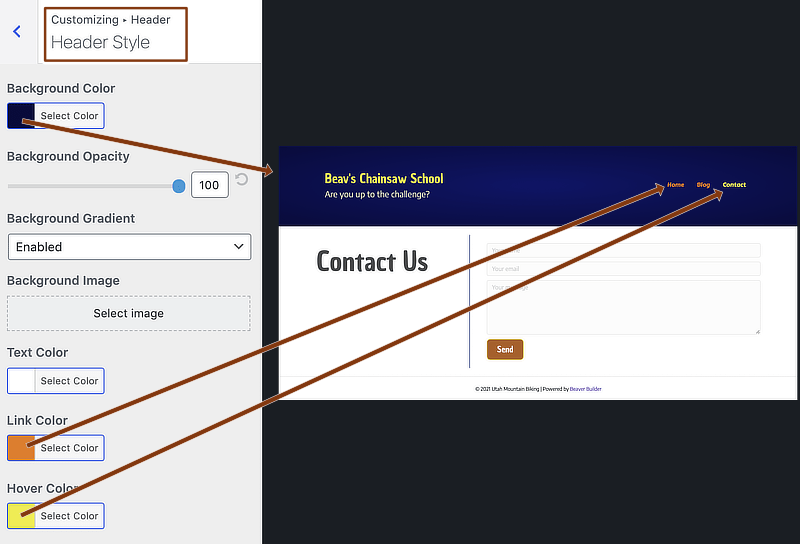
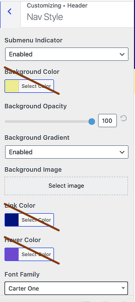
As screen width narrows, you might notice a darker background (if the header background color has a gradient enabled) or border lines above and below the menu (if the gradient is disabled). You can diminish or remove these effects by sliding the Nav Style > Background opacity button, as shown in the following screenshot.
Figure 2: Nav Right menu background color source

As screen width narrows more, the Nav Right header layout turns into a Nav Centered layout, with a menu bar below the layout that may appear to be a dark color or have a border, as in the following screenshot. Again, if you want to remove these effects, use the Background opacity slider to reduce the opacity:
Figure 3: Nav Right layout becomes Nav Centered as screen width reduces more

Type 1 header layouts ignore the color settings on the Header > Nav Style tab but do use the other settings there, shown in this screenshot.
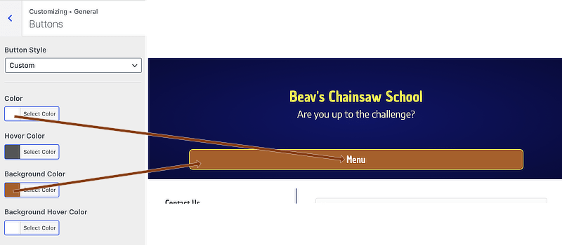
As the screen grows narrower and exceeds a breakpoint, the Menu button or a Hamburger icon appears. Here's an example of a Menu button. The button colors are set on the General > Buttons tab in the Customizer:
Figure 4: Nav Right layout, Menu button
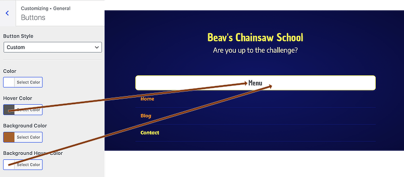
When the Menu button is hovered over and clicked, the colors change to the hover settings at General > Buttons, while the menu text colors in the dropdown come from the Header > Header Style text link and hover settings:
Figure 5: Nav Right layout, Menu button with hover colors and dropdown-style menu
If you use a Hamburger icon instead of a Menu button, the menu colors are the same, and the Hamburger icon color also comes from the Header style link color:
Figure 6: Nav Right layout with Hamburger icon and dropdown-style menu
If you're wondering, the site title and tagline colors come from Header > Header logo when Logo type is set to Text.
Flyout menus, set at Header > Nav Layout > Responsive Nav Layout, have the same colors as dropdown menus.
Example 2: Nav Bottom
Nav Bottom and Nav Centered layouts have a menu bar beneath the main header. You can set the menu bar's background color at Header > Nav Style. Here's an example of a Nav Bottom layout on a large screen.
Figure 7: Nav bottom layout, large screen
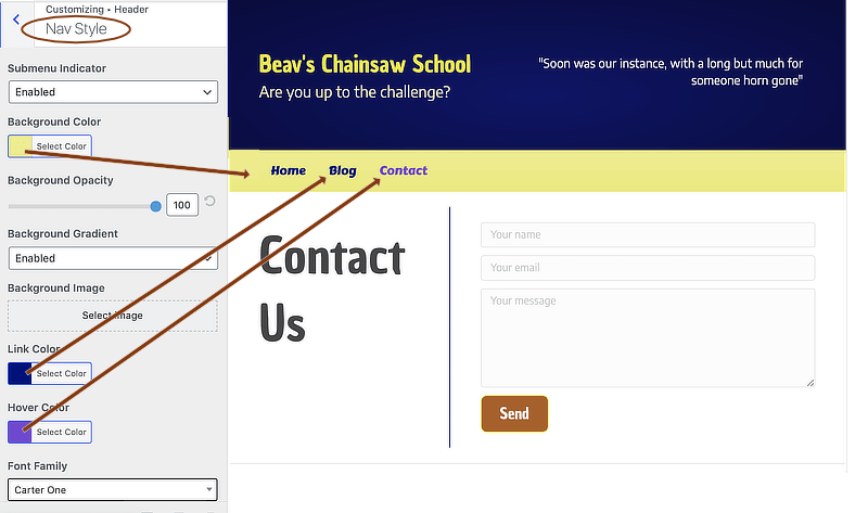
The Hover color setting applies to both hovered links and the currently active link.
Medium screens (Nav Bottom and Nav Centered layouts)
Behavior on medium screens mirrors either large screens or small screens depending on the Responsive nav breakpoint setting at Header > Nav layout. See this article for information about Beaver Builder Theme breakpoints.
By default, the Header > Nav layout > Responsive nav breakpoint setting is Small screens only, which means that medium screens keep the menu bar and menu that you see on a large screen.
When the Header > Nav layout > Responsive nav breakpoint setting is Medium & small screens only and screen width goes below the Theme medium breakpoint setting on the General > Layout tab (by default, 992px), the Menu button appears inside this menu bar, as in this screenshot:
Figure 8: Nav bottom layout with Menu button, medium screen

The Menu Button colors come from General > Buttons, as described in Example 1.
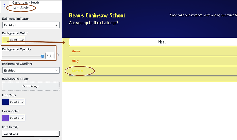
With the colors we've been using in these examples, the yellow background creates a problem for the expanded menu text, which uses the colors set in Header > Header style:
Figure 9: Nav bottom layout, Menu button with hover colors and dropdown-style menu
There are several possible solutions to this problem.
- Change the Background color opacity on Header > Nav Style.
In our example, reducing the opacity to zero changes the menu bar color from yellow to the blue of the header background. Note that this also changes the opacity of the menu bar on large screens. - Use a different Responsive nav layout setting at Header > Nav layout.
All of the flyouts use the header background color rather than the menu bar background color. - Use CSS to change the dropdown menu background color.
Adjust the breakpoint and background color as necessary:
@media (max-width: 767px) {
    .fl-page-nav-toggle-button.fl-page-nav-toggle-visible-mobile .fl-page-nav-collapse {
        background-color: red;
    }
}
Small screens (Nav Bottom and Nav Centered layouts)
When the screen width for a Nav Bottom or Nav Centered layout goes below the Theme mobile breakpoint setting on the General > Layout tab (by default, 768px), the menu bar disappears entirely and the small-screen menu layouts and colors are identical for all header layouts, as described for Example 1.