Set responsive default text styles for Beaver Builder layouts
In the Beaver Builder Theme, you can set responsive heading and text styles that serve as the default heading and text settings for Beaver Builder and Beaver Themer layouts. These custom defaults can then be overridden in individual Heading modules in the Beaver Builder editor, and color can be customized in rows, columns, and many modules.
- The default settings that appear on this tab come from the theme preset, which is set in Customize > Presets.
Click the circular arrow icon to the right of a field to return to the default setting. - These default settings also apply as defaults to headings and text in WordPress block editor layouts, though they will not display until you preview or view the page.
Set default heading styles
Go to Customize > General > Headings to change default heading styles.
Set font family, weight, format
If the Style headings field is set to All headings, you can set the following default heading styles that apply to all heading sizes, H1 through H6.
- Color
- Font family
You can choose a system font, a system-ui font, or a Google font. - Font weight
If you choose a system or system-ui font, you can choose Light, Normal, or Bold weights. If you choose a Google font, you can choose any variant offered for that font, both font weight and italic. - Font format
Regular, Capitalize (every word) Upper case, Lower case
If the Style headings field is set to Custom H1 style, you can set these H1 styles separately from the H2 - H6 headings.
Set font size, line height, letter spacing
You can also set the following font styles individually for each heading size, H1 through H6:
- Font size
Set the font size in pixels. - Line height
See this W3Schools article for more information about line height. - Letter spacing
The amount of horizontal space between letters in the heading.
Change font size for medium and small screens
The font size, line height, and letter spacing settings apply to all screen sizes, but you can change the settings for medium and small devices like this:
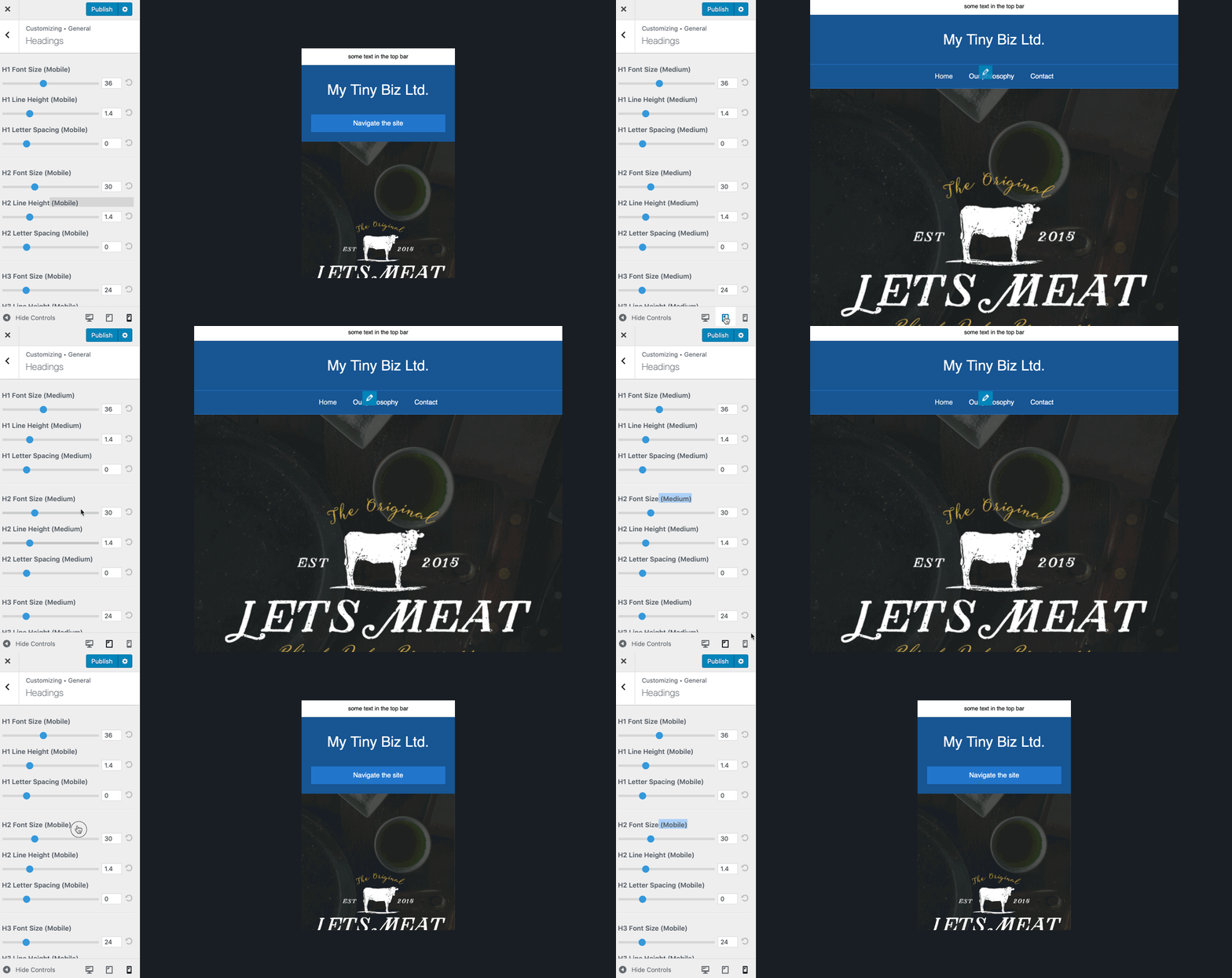
- At the bottom of the General > Headings Customizer panel, click the tablet or phone icon to change to medium and mobile settings respectively.
The font size, line height, and letter spacing field labels append (Medium) or (Mobile) to show the screen size the setting will apply to.
Here's an animation that shows how to select medium and mobile settings. You can see the responsive settings icons at the bottom of the Customizer panel and see how the labels on the heading text settings change.

Set default text styles
Go to Customize > General > Text to change default text styles.
You can set default text styles for non-heading text. Like headings, the initial default settings come from the theme preset you selected, and these settings can be overridden in individual rows, columns, and modules in the Beaver Builder editor. Like headings, these settings become the defaults in Beaver Builder and Beaver Themer layouts, which you can override with settings in individual rows, columns, and modules.
You can modify the following settings for text:
- Color
- Font family
- Font weight
For Google fonts, all of the weights and italic forms included with a particular font are listed. - Font size (responsive)
Font size applies to all screen sizes unless you create different settings for medium and small screen sizes. Use the same procedure described in the previous section. - Line height (responsive)
Line height applies to all screen sizes unless you create different responsive settings for medium and mobile.