Outline Panel
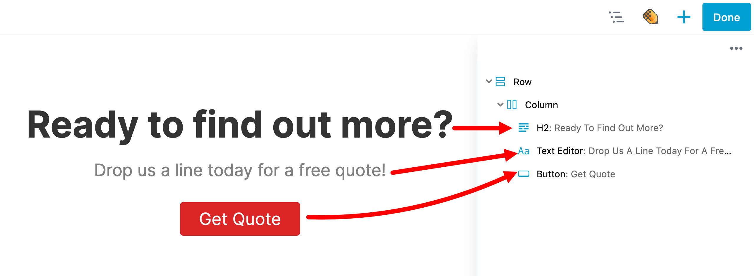
The Outline panel provides a bird's eye view of all the content on your layout and a streamlined interface to edit and interact with layout content.
Usage
Attempting to drag a row from "below the fold" on a long page could always be a bit agonizing. The Outline panel makes it easy to rearrange content on large pages and to quickly jump around and edit different parts of a page.
Access Outline Panel
Click the Outline icon in the Top Bar to open the Outline panel, which lets you view and modify the structure of your page layout in an outline format:

The Outline panel doesn't have a drag handle, but you can remove its overlap on the layout with this trick. First display the Content panel and the use the drag handle to pin it to the right of the layout, then click the Outline panel icon. It then overlays the Content panel.
Expand/Collapse
You can Expand (show) and Collapse (hide) all items using the Outline Panel actions menu item ( Ellipsis icon).
By using persistent storage, the Outline Panel keeps track of what sections have been expanded and collapsed.
Keyboard Shortcut
Using the Outline Panel's keyboard shortcuts, you can open and close the Outline Panel as well as expand and collapse the tree view.
- Toggle Outline Panel - Shift & O
- Expand or Collapse the Tree View - Shift & T
Navigate
Click once in any entry in the Outline panel to scroll to that node (row, column, or module) in the layout. Click twice to open that node's settings.
Move Content
You can quickly move content such as rows, columns (except for child columns), and modules within the Outline Panel using drag-and-drop.
Right-Click
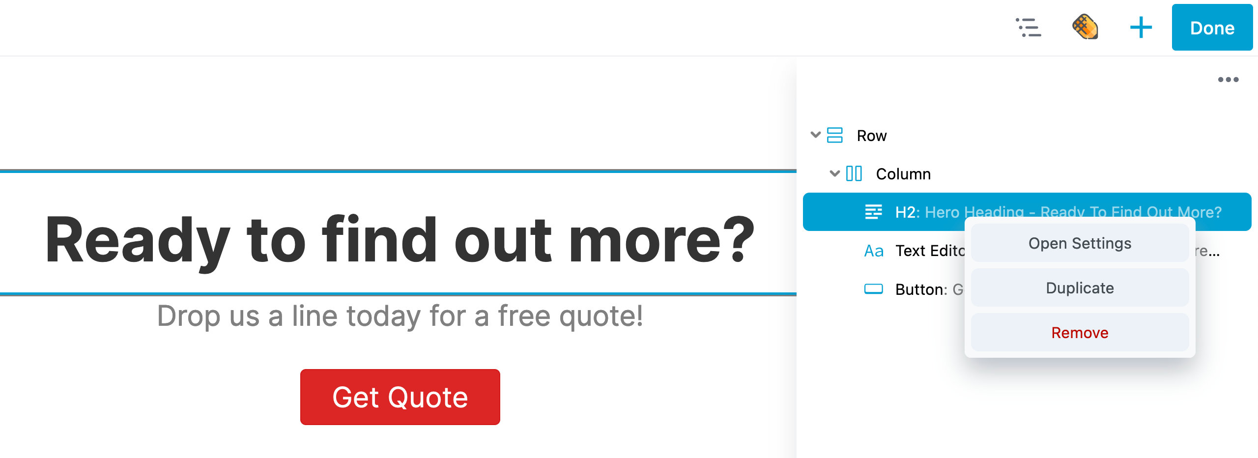
Right-click any row, column, or module to see a list of available options. This action will also result in a blue outline appearing around the selected item within the builder.
- Rows and Columns have Open settings and Remove options.
- Modules have Open settings, Duplicate, and Remove options.

Labels
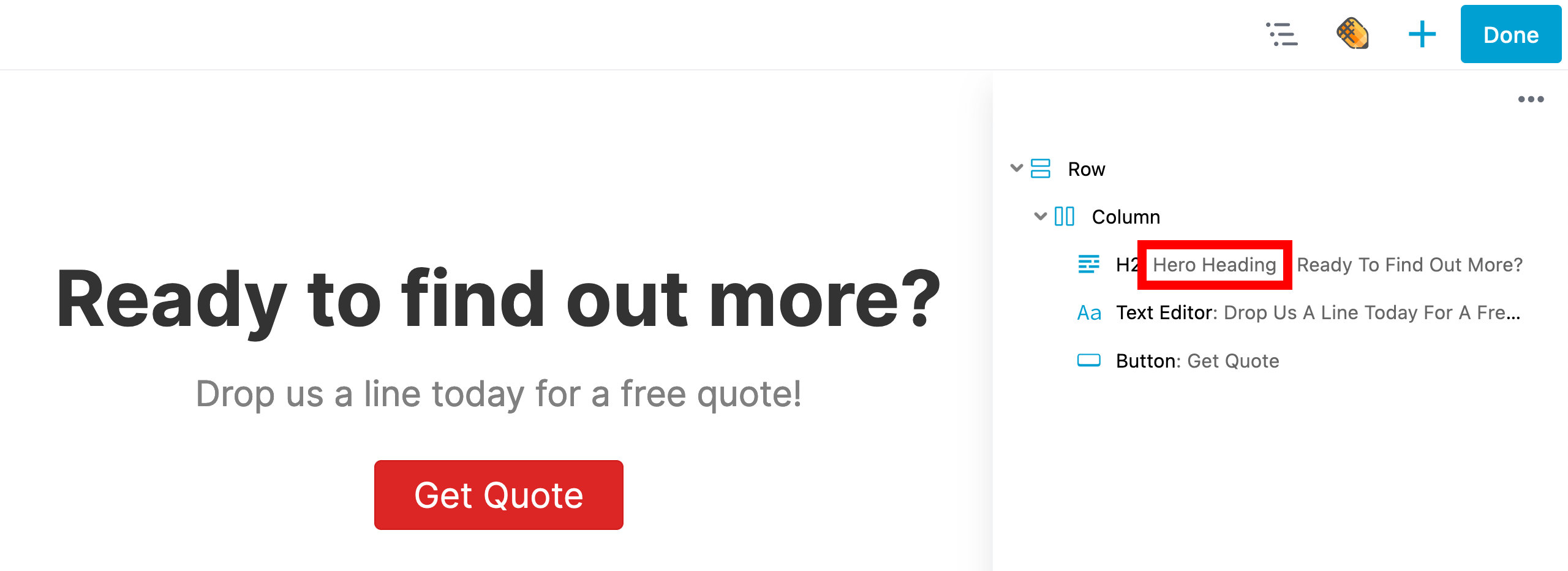
To help identify the purpose of a row, column, or module in the Outline Panel tree view, you can add a label through the Advanced tab. The screenshot below shows an example where a label "Hero Heading" was added to a Heading module and is displayed in the Outline Panel.

Icon Indicators
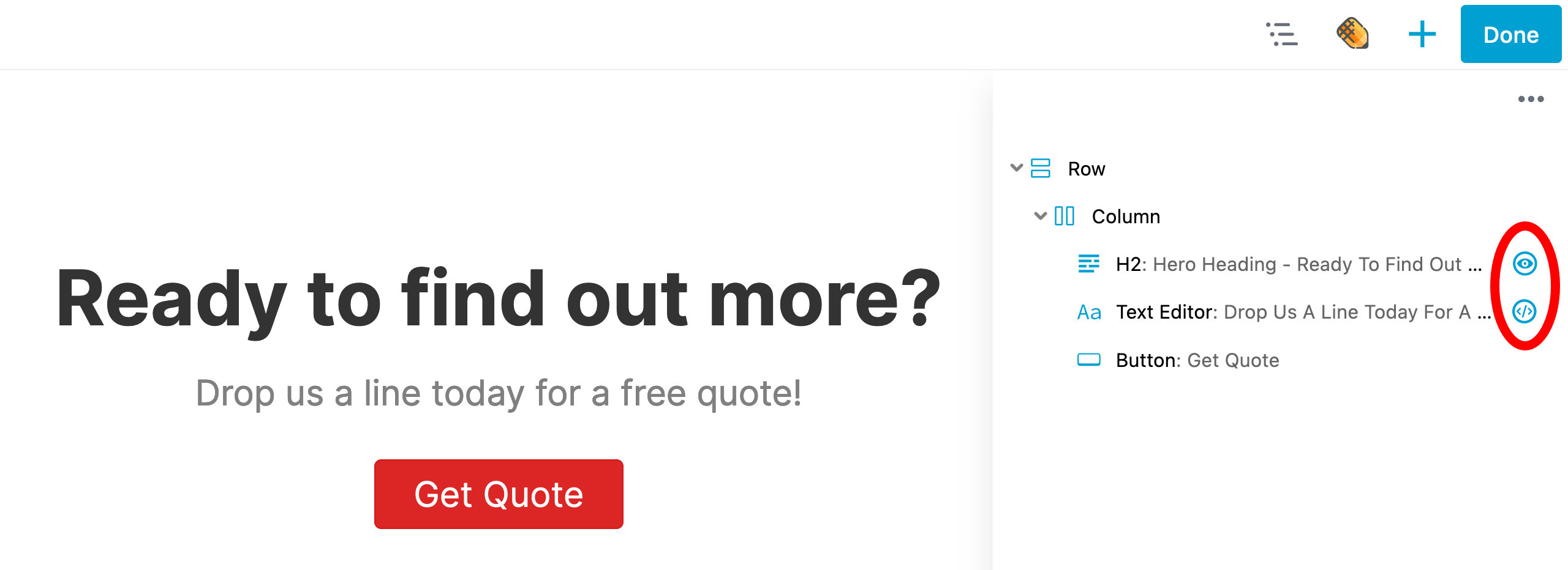
In the Outline Panel, icons will appear when the display visibility settings for a row, column, or module have been modified or when custom CSS or JavaScript has been added to them using the CSS or JavaScript sections in the Advanced tab.
The Eye icon indicates that the display visibility settings for that row, column, or module have been changed from the default state, which is "Always."
The Code icon indicates that custom CSS or JavaScript has been added to the row, column, or module through the CSS or JavaScript sections found in the Advanced tab.
